Matplotlib 是 Python 的绘图库。 它可与 NumPy 一起使用,提供了一种有效的 MatLab 开源替代方案。 它也可以和图形工具包一起使用,如 PyQt 和 wxPython
国内源下载
pip3 install matplotlib -i https://pypi.tuna.tsinghua.edu.cn/simpleimport numpy as np
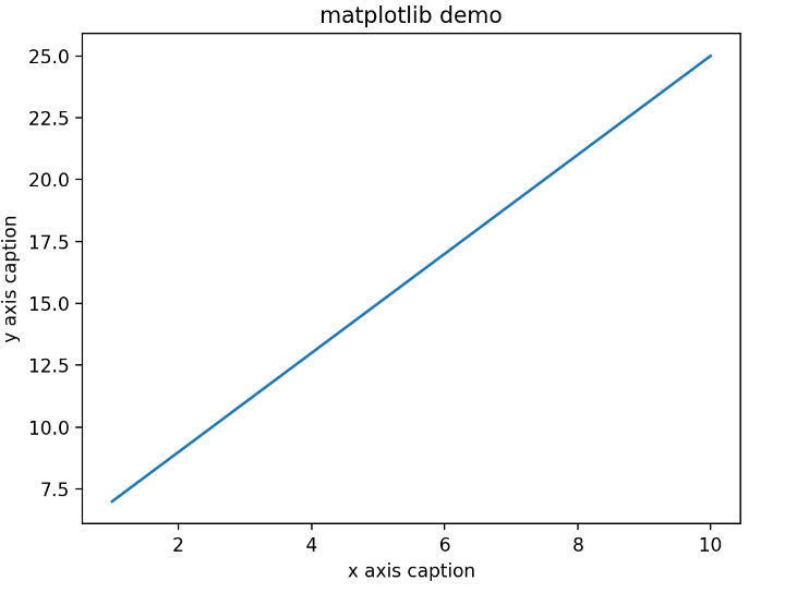
from matplotlib import pyplot as plt
x = np.arange(1, 11)
y = 2 * x + 5
plt.title('matplotlib demo')
plt.xlabel('x axis caption')
plt.ylabel('y axis caption')
plt.plot(x, y)
plt.show()
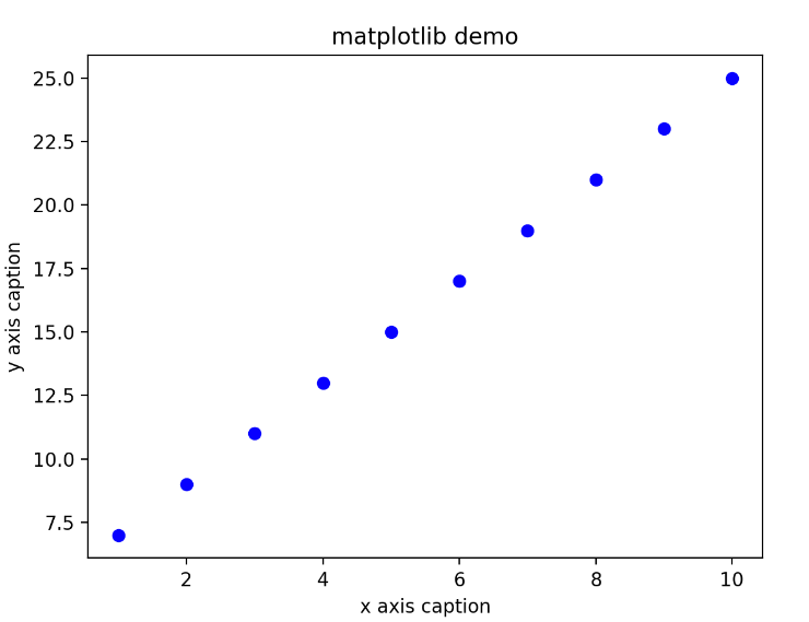
要显示圆来代表点,而不是上面示例中的线,请使用 ob 作为 plot() 函数中的格式字符串。
import numpy as np
from matplotlib import pyplot as plt
x = np.arange(1, 11)
y = 2 * x + 5
plt.title('matplotlib demo')
plt.xlabel('x axis caption')
plt.ylabel('y axis caption')
plt.plot(x, y, 'ob')
plt.show()
绘制正弦波
import numpy as np
import matplotlib.pyplot as plt
x = np.arange(0, 3  * np.pi, 0.1)
y = np.sin(x)
plt.title("sine wave form")
plt.plot(x, y)
plt.show()
subplot() 函数允许你在同一图中绘制不同的东西。
import numpy as np
import matplotlib.pyplot as plt
x = np.arange(0, 3 * np.pi, 0.1)
y_sin = np.sin(x)
y_cos = np.cos(x)
plt.subplot(2, 1, 1)
plt.plot(x, y_sin)
plt.title('Sin')
plt.subplot(2, 1, 2)
plt.plot(x, y_cos)
plt.title('Cosine')
plt.show()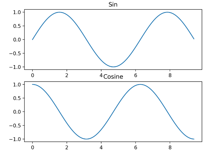
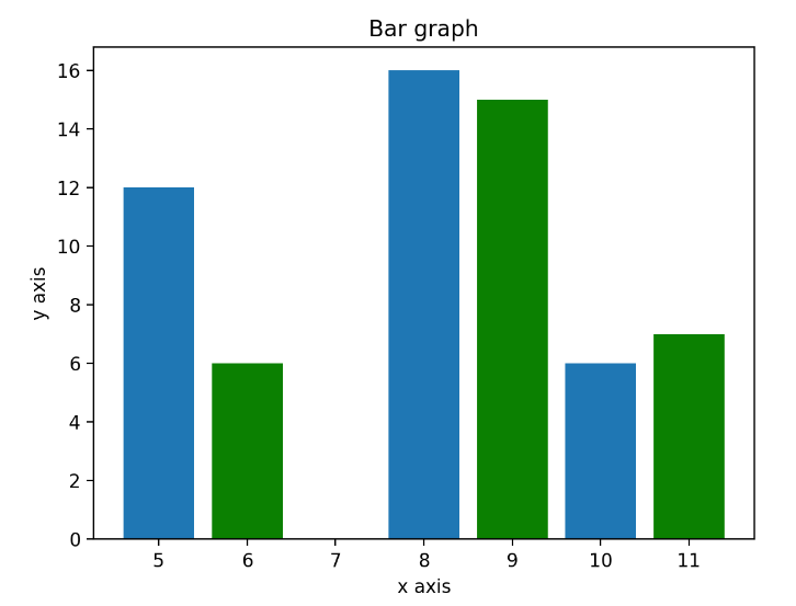
pyplot 子模块提供 bar() 函数来生成条形图。
from matplotlib import pyplot as plt
x = [5, 8, 10]
y = [12, 16, 6]
x2 = [6, 9, 11]
y2 = [6, 15, 7]
plt.bar(x, y, align='center')
plt.bar(x2, y2, color = 'green', align='center')
plt.title('Bar graph')
plt.ylabel('y axis')
plt.xlabel('x axis')
plt.show()
numpy.histogram() 函数是数据的频率分布的图形表示
numpy.histogram()函数将输入数组和 bin 作为两个参数
import numpy as np
a = np.array([22, 87, 5, 43, 56, 73, 55, 54, 11, 20, 51, 5, 79, 31, 27])
np.histogram(a, bins=[0, 20, 40, 60, 80, 100])
hits, bins = np.histogram(a, bins=[0, 20, 40, 60, 80, 100])
print(hits)
print(bins)

[3 4 5 2 1]
[  0  20  40  60  80 100]
Matplotlib 可以将直方图的数字表示转换为图形
import numpy as np
from matplotlib import pyplot as plt
a = np.array([22, 87, 5, 43, 56, 73, 55, 54, 11, 20, 51, 5, 79, 31, 27])
plt.hist(a, bins=[0, 20, 40, 60, 80, 100])
plt.title("histogram")
plt.show()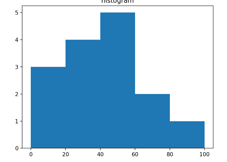

0 Comments